
For this tutorial, we’ll create a very basic theme named “my-theme” based on the Twitter Bootstrap frontend framework.
You can see it in action right here at the end of this tutorial.
You can also download the theme’s sources directly here (ZIP file 115Ko) or build the theme step by step with the help of the tutorial below.
We are not going into any details of the underlying principles of WP-AppKit themes and apps in this tutorial. To know more or to dive directly into your own theme development, the WP-AppKit Theme documentation is your best bet.
Setting Up Theme Directory and Template Files
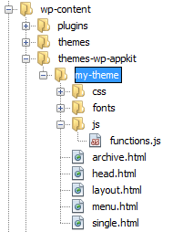
Create a new directory “my-theme” under the “wp-content/themes-wp-appkit” directory.
In this new directory (“wp-content/themes-wp-appkit/my-theme”), create the following template files (empty for now, but required):
- my-theme/archive.html
- my-theme/head.html
- my-theme/layout.html
- my-theme/menu.html
- my-theme/single.html
Create a “js” sub-directory: “my-theme/js”, and a file named “functions.js” inside it (“my-theme/js/functions.js”). It’s also an empty file for now, but it is required too.
Finally create “css” and “fonts” sub-folders. They’re optional but we’ll use them in this tutorial.
You should now have come to this :
Theme’s Styles and JavaScript
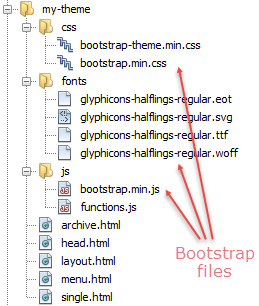
Download the Twitter Bootstrap resources either by getting the last and up to date version from here, or by downloading the ones we used when building this tutorial (Bootstrap v3.2.0, ZIP file 112Ko).
Copy Twitter Bootstrap CSS, fonts and JavaScript in your theme folder in the corresponding “my-theme/css”, “my-theme/fonts” and “my-theme/js” sub-folders.
If you downloaded Bootstrap from the Bootstrap website: note that we don’t need all the files that the default Bootstrap download includes. Here are the only files this tutorial requires :
- css/bootstrap.min.css
- css/bootstrap-theme.min.css
- fonts/glyphicons-halflings-regular.*
- js / bootstrap.min.js
Your theme should now have the following files :
To link the Bootstrap CSS files in our theme, open the “my-theme/head.html” template and insert :
<link rel="stylesheet" href="<%= theme_path %>/css/bootstrap.min.css">
<link rel="stylesheet" href="<%= theme_path %>/css/bootstrap-theme.min.css">
While we’re in our head.html template, also add the content-type meta and a mobile oriented viewport meta, which gives us :
<meta http-equiv="Content-Type" content="text/html; charset=UTF-8" />
<meta name="viewport" content="width=device-width, initial-scale=1.0, maximum-scale=1.0, user-scalable=no">
<link rel="stylesheet" href="<%= theme_path %>/css/bootstrap.min.css">
<link rel="stylesheet" href="<%= theme_path %>/css/bootstrap-theme.min.css">
To plug the Bootstrap JavaScript file to our theme, open the “functions.js” file and insert :
define(['theme/js/bootstrap.min'],function(){
     //Nothing for now, this is just to include the bootstrap.min.js file in our theme.
});
It may be surprising that we don’t include Javascript files in the head.html template along with CSS files, please see the JavaScript in themes section of the documentation to see why this is the right way to add JavaScript resources to WP-AppKit themes.
Theme Layout
Copy the following HTML code into the “layout.html” template file :
<nav class="navbar navbar-default navbar-fixed-top" role="navigation">
    <div class="navbar-header" >
        <button type="button" class="navbar-toggle collapsed" data-toggle="collapse" data-target="#navbar-collapse">
            <span class="sr-only">Toggle navigation</span>
            <span class="icon-bar"></span>
            <span class="icon-bar"></span>
            <span class="icon-bar"></span>
        </button>
        <span class="navbar-brand"><a href="#"><%= app_title %></a></span>
    </div>
    <div class="collapse navbar-collapse" id="navbar-collapse">
        <%= menu %>
    </div>
</nav>
<div class="container" style="padding-top: 45px;"><%= content %></div>
This HTML structure is the standard way of including a “fixed to top navbar with hamburger menu button” with Twitter Bootstrap. You’ll notice 3 WP-AppKit template tags here :
- <%= app_title %> : displays the app title as defined in the WordPress admin.
- <%= menu %> : automatically displays the content of the “menu.html” template (see below).
- <%= content %> : automatically displays the current screen content, using the “archive.html” template if a post list is displayed or the “single.html” template if a post is displayed.
You can find details about this template tags in the documentation.
App Navigation Menu
The “menu.html” template is used to render the app’s navigation. Copy the following HTML code into “menu.html” :
<ul class="nav navbar-nav">
    <% if( menu_items.length ){ %>
        <% _.each( menu_items, function( menu_item ){ %>
            <li>
                <a href="<%= menu_item.link %>">
                    <%= menu_item.label %>
                    <span class="glyphicon glyphicon-chevron-right pull-right visible-xs"></span>
                </a>
            </li>
        <% }) %>
    <% } %>
</ul>
Here, we loop on the menu_items WP-AppKit’s object to display each menu item as a <li> list element.
The JavaScript template engine (code inside <% … %> that you see in templates) used in WP-AppKit is the underscore.js : more info about that here.Post Lists
Post lists (posts for a WordPress category for example) are displayed using the “archive.html” template. Copy the following into your “archive.html” :
<h1><%= list_title %></h1>
<% if(posts.length){ %>
<ul class="media-list">
<% _.each( posts, function( post ){ %>
<div class="media">
<% if( post.thumbnail.src && post.thumbnail.src.length ){ %>
<img class="media-object pull-left" src="<%= post.thumbnail.src %>" style="width: 87px; height: 58px;">
<% } %>
<div class="media-body">
<h4 class="media-heading">
<a href="<%= TemplateTags.getPostLink(post.id) %>" class="pull-left"><%= post.title %></a>
<small class="small"><%= TemplateTags.formatDate(post.date,'d/m/Y') %></small>
</h4>
<p><%= post.excerpt %></p>
</div>
</div>
<% }); %>
</ul>
<% }else{ %>
<p>No post found!</p>
<% } %>
<%= list_title %> displays the current list title (name of the category for example).
We loop on the posts WP-AppKit’s object to display each post as a Bootstrap media object list item.
You can see that each post has the following properties (among others not used here): thumbnail, title, date and excerpt.
We use the TemplateTags WP-AppKit’s module to get post links and format post dates.
Post Detail
Post details are displayed using the “single.html” template. Copy the following code into your “single.html“:
<h1><%= post.title %></h1>
<%= TemplateTags.formatDate(post.date,'d/m/Y') %>
<div id="single-content">
    <% if(  post.thumbnail && post.thumbnail.src && post.thumbnail.src.length ){ %>
        <img src="<%= post.thumbnail.src %>" />
    <% } %>
    <%= post.content %>
</div>
The post WP-AppKit’s object has the exact same properties as in the “archive.html” template. Here we display post title, date, thumbnail (if the post has one) and content.
Ok, This Is It, Let’s See Our Theme In Action, Shall We?
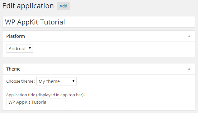
You can now create an app in WordPress.
- Go to “WP-AppKit > Applications”
- Click “Add new”
- Set a title (only used in WordPress admin, not in the app) : here we name it “WP AppKit Tutorial”
- Set a platform (Android/iOS) even if it has no influence here since we won’t deploy it on a device in this tutorial
- In the “Theme” box, set “Application Title” (“WP AppKit Tutorial” again in this example) and choose your “My theme” theme in the themes’ list :
- Publish your app by clicking the blue “Publish” button
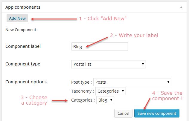
- Now, add components (ie content) to the app : in the “App Components” box, click “Add new” to set some “Posts list” components based on your WordPress categories (or any taxonomies you may have) :
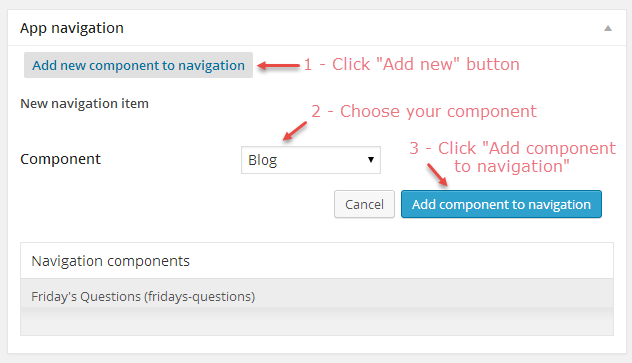
- And finally, add those components to your app navigation by clicking “Add new component to navigation” in the “App Navigation” box :
- In the “App Simulation” box, click “View application in browser” :
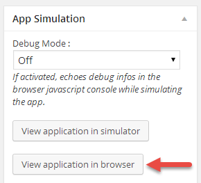
Your app should launch! For a more “close to mobile reality” experience, resize your browser to a mobile size (manually or better : using your browser mobile device emulator).
To go further
The best way to go if you want to make your own WP-AppKit themes is to read the documentation and have a look to the Nihao default themes.
Or, you could just start to play along rewriting the templates of this tutorial with your own HTML structure and your own CSS/Javascript. To do so, you may need 2 more things :
1 – Add your own CSS stylesheet :
For example, to extend all our posts images to full width :
- Add a “my-styles.css” file to my-theme/css, that contains :
#single-content img{ /* See the single.html template where we displayed our post content inside a <div id="single-content"> so that we can target it in CSS */ width: 100%; height: auto; } - Link this new CSS file to your theme : append the following to your head.html template :
<link rel="stylesheet" href="<%= theme_path %>/css/my-styles.css">
2 – Add your own javascript to the functions.js :
For example, let’s close the navigation menu when we click a link inside it, and scroll to top at each screen change :
Replace your my-theme/js/functions.js content by :
define(['jquery', 'core/theme-app', 'theme/js/bootstrap.min'],function($, App){

	//See https://uncategorized-creations.com/wp-appkit/doc/#237-functions-js to
	//learn more about what you can do in this functions.js file.

	/**
	 * Close menu when we click a link inside it.
	 * The menu can be dynamically refreshed, so we use "on" on
	 * parent div (which is always here):
	 */
	$( '#navbar-collapse' ).on( 'click', 'a', function() {
		closeMenu();
	} );

	/**
	 * Scroll to top each time a new screen is showed in the app.
	 * 'screen:showed' is an AppKit event that allows to intercept
	 * change of screen in the app (list to post detail for example).
	 */
	App.on( 'screen:showed', function( current_screen, view ) {
		scrollTop();
	} );

	/**
	 * Close the bootstrap navbar manually
	 */
	function closeMenu() {
		var navbar_toggle_button = $( ".navbar-toggle" ).eq( 0 );
		if ( !navbar_toggle_button.hasClass( 'collapsed' ) ) {
			navbar_toggle_button.click();
		}
	}

	/**
	 * Get back to the top of the screen
	 */
	function scrollTop() {
		window.scrollTo( 0, 0 );
	}

});
On the first line, we add the “jquery” and “core/app-theme” dependencies and say that we are going to access them through “$” and “App”.
Then, we write “normal” jquery DOM manipulation and use the AppKit “screen:showed” event to intercept app screen changes.
Wrapping Things Up
You should now understand the basic principles behind WP-AppKit Themes. To learn more, check the javascript in AppKit themes documentation section.
To test the basic sample AppKit theme “my-theme” built in this tutorial : download it here (ZIP file 115Ko) and unzip it to your “wp-content/plugins/wp-app-kit/app/themes” directory. Have something to say about this article? Great! Comments are there for that. Please remember that comments are moderared. SPAM or off-topics comments won’t be published.
Merci Mathieu pour ce tuto très complet. Je n’ai plus d’excuse 🙂
I have downloaded the wp-appkit-master.zip from github and tried to upload as a plugin into wordpress. The operation fails as no valid plugins were found. Do you have any ideas I’m using wordpress 4.1
Hi Mike, to make it work: open wp-app-kit-master.zip locally and extract the wp-app-kit folder. Zip the extracted folder. You will be able to use this new archive as a valid plugin. Please let us know if it has not worked.
thanks that worked
Is there a way to include google maps into a page and have it displayed.
I have tried a google maps plugin which creates a shortcode after filling in map details in form on backend and then typing that shortcode into static page also just typing in the code direct from google with my own api key. Both give me a blank page.
I really like this plugin by the way It has great potential!!
Hi Mike, including a Google Maps can be tricky as it is mainly driven by JavaScript. Could you tell us which plugin you use? We’ll check to see if we can do something with it.
Hi Benjamin
here is the link to it, I’m using the free version
http://www.wpgmaps.com/
regards
Got it! 🙂 Please be patient – we’re preparing WordCamp Paris – after that, we’ll get back to you.
Hi Mr. Ben,
Awesome article and info. Please I want to know that how are we going to yse plugins into our app. Normally, we add plugin by using following command on cli which
” cordova plugin add <> ”
So my question is, after doing the thing mentioned above. How are we going to use that plugin for our app.
Hi, could you tell me if you intend to use CLI or PhoneGap Build?
Hi I did everything as mentioned above, When I click on view application on browser, nothing appears only blank, Please be fast.
Did you activate permalinks?
Hello
thanks
I use this plugin to make mobile app.
but after create . and then click on the preview in browser.
display blank page and no contain the websiteposts.
In the Android phone dosent display the theme..
please help.
Hi, did you enable permalinks?
how can I add theme events <like text sizes buttons> to the original Q theme for android?
Sorry but I am not sure to get the question correctly (notably the like text sizes buttons). Could you be more specific?
Oh, i mean a button in the panel-header to resize the article’s text
Here’s below quick steps to that:
If you need more, you can write to support[at]uncategorized-creations.com.